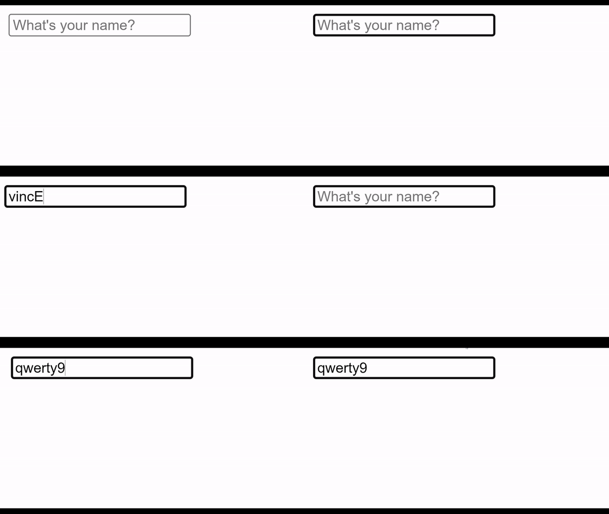
Shake animations are visual effects that can be used to alert a user about an error or invalid input. In this example, this means rapidly moving an element horizontally back and forth to simulate it being shaken.
The best part about this? This effect can be achieved using only HTML and CSS, with no JavaScript or other programming languages required.
Add Input Element
The first step in creating a shake animation is to define the element that will be shaking. Any HTML element, such as an input field or a button, can be used. We used an input field in our example:
<head>
    <link rel="stylesheet" href="styles.css" type="text/css" />
</head>
<body>
    <input type="text"
    pattern="[a-z]*"
    placeholder="What's your name?"
    />
</body>
If you now open your index.html file, you should see something like this:

Add CSS Class and Animation
One way to create the shaking effect is to use the CSS transform property. This property allows us to rotate, scale, or translate (move) an element. To create the shaking effect, we will use the translateX function to move the element horizontally back and forth.
First, we will define the starting position of the element using the transform: translateX(0) style. This style ensures that the element is in its normal position when the shake animation is not triggered.
Next, we will define the CSS keyframes for the shake animation. Keyframes allow us to specify different styles for an element at different points in the animation. To create the shake animation, we will define three keyframes: one for the starting position of the element, one for the middle position, and one for the end position.
In the starting keyframe, we will use the transform: translateX(4px) style to set the element’s position to the right. In the middle keyframe, we will use the transform: translateX(-4px) style to move the element 4 pixels to the left. We will then use the translateX(4px)animation-iteration-count property.
Here’s what the CSS for the shake animation should look like:
input:invalid {
    animation: shake .3s;
    animation-iteration-count: 3;
}

@keyframes shake {
    25% { transform: translateX(4px)}
    50% { transform: translateX(-4px)}
    75% { transform: translateX(4px)}
}
Conclusion
With just a few lines of HTML and CSS, we have created a simple but effective shake animation that can be used to indicate an error or invalid input to the user.
Below you can see how it looks visually by opening the index.html file.


