With the release of Angular v17, a built-in functionality of lazy-loading Angular components, directives, and pipes was introduced. Using the new @defer block, you can specify content to be loaded at a later point in time, called lazy-loading.
Since the initial release of the @defer block, the Angular team has been busy releasing multiple major Angular versions, improving the lazy-loading mechanism’s performance.
This article will be a hands-on tutorial where we go through the possibilities of the @defer block with examples you can easily follow along. Sounds interesting? If so, let’s get started right now!
Getting Started with the Angular @defer Block
Let’s start with the basics, the @defer block itself.
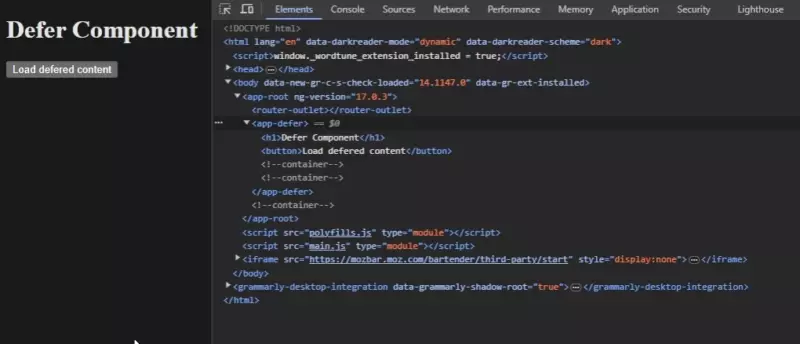
To activate the @defer block, you can use a simple trigger like the when condition. For instance, you can use a button to trigger the lazy loading of the deferred content. When the button is clicked, the boolean variable isVisible is set to true. As this variable is used for the when condition, it prompts the deferred content to appear in the DOM.
Deferred Content
} `, }) export class DeferComponent { isVisible = false; toggleContent(): void { this.isVisible = true; } }” style=”color:#e1e4e8;display:none” aria-label=”Copy” class=”code-block-pro-copy-button”>@Component({
selector: "app-defer",
standalone: true,
imports: [CommonModule],
template: `
<h1>Defer Component</h1>
<button (click)="toggleContent()">Load deferred content</button>
@defer (when isVisible) {
<p>Deferred Content</p>
}
`,
})
export class DeferComponent {
isVisible = false;
toggleContent(): void {
this.isVisible = true;
}
}By running this example, you can see the result of the deferred content becoming visible when pressing the button:

Note: Only standalone content and content not directly referenced inside the same file can be lazily loaded.
Type of Defer Triggers in Angular
The most common trigger for the @defer block is the when condition, which we’ve already explained. This trigger is the most common because of its customizable nature, i.e. you can define custom conditions using it.
Besides using the when condition, the @defer block also supports the on condition. The on condition is used for adding triggers based on other elements in the DOM or the browser itself, for example when the user is hovering over an element or after the page has finished rendering.
Below is a list of all types of defer triggers which the @defer block supports:
| Trigger | Description |
| on idle | when the browser reports idle state (default) |
| on viewport(<elementRef>?) | when the element enters the viewport |
| on interaction(<elementRef>?) | when clicked, touched, or focused |
| on hover(<elementRef>?) | when the element has been hovered |
| on immediate | when the page finishes rendering |
| on timer(<duration>) | after a specific timeout |
| when <condition> | on a custom condition |
We will go through examples using these different triggers later on in this tutorial
Deferrable View Blocks
When using the @defer block, you can also bind other type of blocks to it, for defining what content to show in the DOM at different stages of the loading process.
The @placeholder Block
The placeholder block is used to define what content to show before the @defer block have been triggered.
Any content can be placed inside the @placeholder block, like plain HTML, Angular components, directives, and pipes. However, note that all content inside this block is eagerly loaded (default loading of content in Angular and not lazy-loaded).
Here’s how you add the @placeholder block to your @defer block:
@defer {
    <p>Deferred Content</p>
    //Lot of deferred content below
    //...
} @placeholder (minimum 1000ms) {
  <p>Placeholder content here!</p>
}Note: According to proper user experience, you should always have a placeholder in place and show it long enough to get rid of content flickering.
The @loading Block
The @loading block is a sub-block used for showing content during the time the @defer block is loading it’s content.
The @loading block is similar to the @placeholder block in the way that both are using a minimum parameter. The @loading block also uses the after parameter, to define how long to wait after loading begins before showing its content.
You add this block in the same way as we did with the @placeholder block:
@defer {
    <p>Deferred Content</p>
    //Lot of deferred content below
    //...
} @loading (after 100ms; minimum 1s) {
  <progress-spinner />
}Here, the progress-spinner is a component I’ve created which shows a spinner.
The @error Block
The @error block is used to show content when the loading of the content inside the @defer block fails. A good example of this is if you have deferred content depending on an http-call in order to retrieve its data and the http-call fails for some reason.
This type of sub-block does not have any parameters and you define it like this:
@defer {
    <p>Deferred Content</p>
    //Lot of deferred content below
    //...
} @error {
  <p>Failed to load content</p>
}Conclusion
The deferrable views and built-in functionality of lazily loading content is one of the major features included in Angular 17.
In conclusion, this article have explained what the @defer block is used for and all features included with it.
We’ve went through how to use the @defer block and how to show different content depending on which stage the loading is in by utilizing sub-blocks like the @placeholder, @loading, and @error block.
If you’re looking for more articles and tutorials about new Angular features, you should read our article on Angular Control Flow Blocks or why not check out our hands-on article on Using Angular Signals Services.

