In this article, we will take a closer look at Angular Material Cards.
We will show you how to get started working with cards using Angular Material and also show you a cool example of what you can create by using it.
Whether you’re a beginner or an experienced developer, this guide will equip you with the knowledge and techniques to leverage Angular Material Cards effectively in your Angular applications.
Getting Started with Angular Material Cards
Cards is one of those components which can really improve the user experience of your website. It is a good component to use if you want to group content together in a nice and elegant way.
Fortunately, with the help of Angular Material, it is easy to add good-looking cards to your website or application. In order to use Angular Material cards you’ll need to import the MatCardModule to your Angular module.
Let’s import all the modules we need for the example in this tutorial right now before we dig into it. This is what my Angular module looks like and the highlighted rows are the Angular Material modules we’ll need:
import { NgModule } from "@angular/core";
import { BrowserModule } from "@angular/platform-browser";
import { AppRoutingModule } from "./app-routing.module";
import { AppComponent } from "./app.component";

import { BrowserAnimationsModule } from "@angular/platform-browser/animations";
import { MatCardModule } from "@angular/material/card";
import { MatButtonModule } from "@angular/material/button";
import { MatDividerModule } from "@angular/material/divider";
import { MatProgressBarModule } from "@angular/material/progress-bar";
import { MatIconModule } from "@angular/material/icon";

import { CardComponent } from "./components/card/card.component"; //My component where I'll place the examples

@NgModule({
  declarations: [AppComponent, CardComponent],
  imports: [
    BrowserModule,
    AppRoutingModule,
    BrowserAnimationsModule,
    MatCardModule,
    MatButtonModule,
    MatDividerModule,
    MatProgressBarModule,
    MatIconModule,
  ],
  providers: [],
  bootstrap: [AppComponent],
})
export class AppModule {}
That’s all you need to start using cards on your website or application. How about digging into the example now and learn how to build cool stuff with Angular Material cards?
Angular Material Card Examples
Here’s a cool example on how to make a good looking and useful web component with Angular Material Card. Once you’re done with this example you can finally say you have a card up your sleeve!
Create a “Share on Social Media” Card
Have you ever come across those nifty little cards that magically enables you to share your content on social media platforms? No worries if you haven’t! In this example we’ll dive into the process of creating our own “Share on Social Media” card.
The card we’ll create in this example will look like this:

Structure the HTML
The first thing we’ll do is adding all the structural components, directives and elements to our HTML. This is how the example is structured:

All the elements marked out on the image above must be encapsulated inside the mandatory mat-card element. Let’s add all these structural elements, here’s how your HTML should look like after you’ve added all elements:
<mat-card>
  <mat-card-header>
    <div mat-card-avatar></div>
    <mat-card-title></mat-card-title>
    <mat-card-subtitle></mat-card-subtitle>
  </mat-card-header>
  <img mat-card-image/>
  <mat-card-content>
  </mat-card-content>
  <mat-card-actions>
    <button mat-fab extended></button>
    <button mat-fab extended></button>
  </mat-card-actions>
</mat-card>
Now we have a solid structure on which we can continue working on.
Filling The HTML with Content
We will now add content to our structural elements. For the same image of the cat I used in the example, here’s the link.
I placed the image inside the directory src/assets, this way it is easily accessible when I run the application locally and also gets included as a static asset if I decide to bundle and deploy my website.
Here’s how the HTML looks like when I have added the content:
<mat-card class="my-card">
  <mat-card-header>
    <div mat-card-avatar class="header-image"></div>
    <mat-card-title>Hacker Cat</mat-card-title>
    <mat-card-subtitle>Infamous Coding Genius</mat-card-subtitle>
  </mat-card-header>
  <img mat-card-image src="assets/social-cat.png" alt="Hacker Cat" />
  <mat-card-content>
    <p>
      The Hacker Cat is one of the smartest developers existing today. He writes
      code hyperfast and can hack into any IT-system
    </p>
  </mat-card-content>
  <mat-card-actions>
    <button mat-fab extended><mat-icon>favorite</mat-icon>LIKE</button>
    <button mat-fab extended><mat-icon>share</mat-icon>SHARE</button>
  </mat-card-actions>
</mat-card>
Add CSS Styling
You may notice that I also added some classes to my elements, like my-card and header-image. That is needed to keep a good max width on the card and to resize the avatar image to a suitable size. Here’s how the stylesheet looks like:
.my-card {
  margin: 10px;
  max-width: 400px;
}

.header-image {
  background-image: url("http://localhost:4200/assets/social-cat.png");
  background-size: cover;
}

mat-card-actions button {
  margin-left: 5px;
}
Final Result
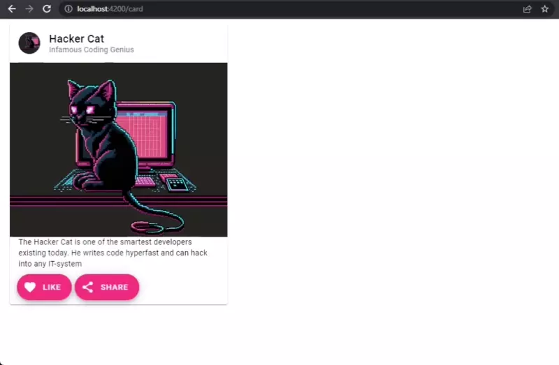
We are now done with the example of how to create a “Share on Social Media” card. If we now run our application we see that the card we just created looks just like the one we showed earlier:

Flexible and Resizable Card Layouts
So far we have only worked with a static card (a card which have a fixed position on the webpage) but it is also possible to create drag-and-drop cards using Angular Material. This is easily accomplished by importing and adding CdkDrag to our card element.
Let’s start by importing CdkDrag to our module:
import { CdkDrag } from "@angular/cdk/drag-drop";

...

imports: [
  ...
  CdkDrag,
],
Next we just need to add the directive, CdkDrag, to the element we want to enable drag-and-drop functionality on. Let’s add it to the “Share on Social Media” card example we showed earlier:
<mat-card class="my-card" cdkDrag>
  <mat-card-header>
    <div mat-card-avatar class="header-image"></div>
    <mat-card-title>Hacker Cat</mat-card-title>
    <mat-card-subtitle>Infamous Coding Genius</mat-card-subtitle>
  </mat-card-header>
  <img mat-card-image src="assets/social-cat.png" alt="Hacker Cat" />
  <mat-card-content>
    <p>
      The Hacker Cat is one of the smartest developers existing today. He writes
      code hyperfast and can hack into any IT-system
    </p>
  </mat-card-content>
  <mat-card-actions>
    <button mat-fab extended><mat-icon>favorite</mat-icon>LIKE</button>
    <button mat-fab extended><mat-icon>share</mat-icon>SHARE</button>
  </mat-card-actions>
</mat-card>
We can now click on the card and then drag it anywhere we want on the screen, like this:

Accessibility
The card component in Angular Material comes with good support for accessibility. You can use several ARIA roles to convey semantic meaning to a portion of the UI.
Depending on what the card content means to your application, you can apply one of role=”group”, role=”region”, or one of the landmark roles to the <mat-card> element.
Here is what the official Angular Material documentation is saying about accessibility on cards.
Conclusion
By incorporating Angular Material cards, building websites and applications offering a great user experience becomes easier.
This article have showed you how to get started working with cards and given you easy-to-follow examples on some of the cool stuff you can build with it.
We also explored how to add drag-and-drop functionality to our cards using CdkDrag, a directive included in the Angular Material library.
I hope you found this tutorial helpful and you followed our examples without getting stuck on the details.
From card tricks to form sorcery, we’ve got you covered with the secrets of UI magic using Angular Material. Join us on this nerdy adventure and level up your web development skills. Explore our other Angular Material articles here!

