In this article, we’ll go through how to use Angular Material Forms, what input types you can use, and best practices when working with Angular Material Forms. Whether you’re a beginner or an experienced developer, this guide will walk you through how to create dynamic and user-friendly forms.
Understanding Angular Material Forms
A form in Angular Material consists of multiple components working together.
The main component which encapsulates everything is called <mat-form-field>. The element, <mat-form-field>, is needed to utilize the styling, validation and labels of Angular Material.
Advantages of Using Angular Material Forms
There are a few key advantages of using Angular Material for creating forms rather than only relying on the built-in functionality of Angular.
Here are a few key advantages of using Angular Material when creating forms:
- Keeps a consistent styling together with all the other elements on the website
- Provides good accessibility, responsiveness, and styling without complex configurations
- Enhance most of the already existing internal Angular form functionality
But enough theory for now, it is time to dig into the practicalities of getting started working with Angular Material forms.
Getting Started with Angular Material Forms
Let’s get started working with forms using Angular Material.
We assume you have already created an Angular application and imported Angular Material before you started reading this tutorial. If you have not set up an Angular Material project and need help doing that, you can check out our article on Getting Started With Angular Material.
The examples we will show you in this tutorial are dependent on the following Angular Material modules:
Since we will work with reactive forms and use animations for our date picker, we also need to import the internal Angular modules ReactiveFormsModule and BrowserAnimationsModule.
Here’s how your app.modules.ts file should look like:
import { NgModule } from "@angular/core";
import { BrowserModule } from "@angular/platform-browser";
import { AppRoutingModule } from "./app-routing.module";
import { AppComponent } from "./app.component";

import { BrowserAnimationsModule } from "@angular/platform-browser/animations";
import { ReactiveFormsModule } from "@angular/forms";
import { MatFormFieldModule } from "@angular/material/form-field";
import { MatInputModule } from "@angular/material/input";
import { MatDatepickerModule } from "@angular/material/datepicker";
import { MatNativeDateModule } from "@angular/material/core";
import { MatIconModule } from "@angular/material/icon";

@NgModule({
  declarations: [AppComponent],
  imports: [
    BrowserModule,
    AppRoutingModule,
    BrowserAnimationsModule,
    ReactiveFormsModule,
    MatFormFieldModule,
    MatInputModule,
    MatDatepickerModule,
    MatNativeDateModule,
    MatIconModule,
  ],
  providers: [],
  bootstrap: [AppComponent],
})
export class AppModule {}
Form Controls and Inputs
Angular Material offers plenty of form controls which simplifies the development of dynamic and user-friendly forms. We will now go through the different types of form controls we will use in this tutorial.
Text Inputs
Angular Material provides a clean and customizable text input component. This component supports validation, error messages, and various input types like text, email, password, and so on. Below you can see some examples of how text inputs look using Angular Material:


There exist more types of text inputs using Angular Material but these are the ones commonly used.
Checkboxes and Radio Buttons
Angular Material offers checkboxes and radio button components with built-in accessibility features and styling. You can easily bind these controls to data models and handle user selections effectively. Here’s an example of how to bind data from checkboxes and radio buttons to objects in our component;
Since we already added the imports needed for working with Angular Material forms, we just added the HTML needed for this example:
<div class="container" [formGroup]="questions">
  <mat-checkbox class="example-margin" formControlName="likeCats">
    I Like Cats 😸
  </mat-checkbox>
  <mat-checkbox class="example-margin" color="warn" formControlName="likeDogs">
    I Like Dogs 🐶
  </mat-checkbox>
</div>

<section class="example-section" [formGroup]="questions">
  <h4>Values:</h4>
  {{ questions.value | json }}
</section>
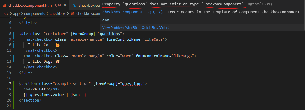
Angular will now complain about the reference to questions, like this:

So, what we need to do is define the property, questions, in our TypeScript file:
import { Component } from "@angular/core";
import { FormBuilder } from "@angular/forms";

@Component({
  selector: "app-checkbox",
  templateUrl: "checkbox.component.html",
  styleUrls: ["./checkbox.component.scss"],
})
export class CheckboxComponent {
  constructor(private _formBuilder: FormBuilder) {}

  questions = this._formBuilder.group({
    likeCats: false,
    likeDogs: false,
  });
}
We inject a formBuilder*, and use it to define our property which binds to the form containing the checkboxes.
*The FormBuilder provides syntactic sugar that shortens creating instances of a FormControl, FormGroup, or FormArray. It reduces the amount of boilerplate needed to build complex forms.
Here’s the result:

Dropdowns
Dropdowns are commonly used when a list of options needs to be presented. In order to utilize the functionality from Angular Material on dropdown elements, we use Angular Material’s mat-select element. This element allows developers to create user-friendly and accessible dropdowns with customizable styling and options for single or multiple selection modes.
Here’s how you add a dropdown to your Angular application. First, make sure you import the MatSelectModule from Angular Material:
import { MatSelectModule } from "@angular/material/select";

...

@NgModule({
  declarations: [
    ...
  ],
  imports: [
    ...
    MatSelectModule,
  ],
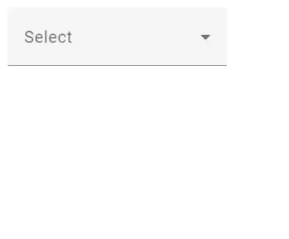
After you’ve imported the required module, you can add dropdowns to your HTML, like this:
<mat-form-field>
  <mat-label>Select</mat-label>
  <mat-select>
    <mat-option value="one">First option</mat-option>
    <mat-option value="two">Second option</mat-option>
  </mat-select>
</mat-form-field>
Datepickers
When dealing with dates and times, Angular Material’s Datepicker component simplifies the input process. The Datepicker control provides users with intuitive interfaces for selecting dates and times, with built-in formatting which minimizes the risk of receiving data containing invalid format.
Toggles
Toggles are useful for selecting values within a defined range or toggling between two states (for example, on and off).
The toggles only need the MatSlideToggleModule, I imported it to app.module.ts:
import {MatSlideToggleModule} from '@angular/material/slide-toggle';

...

imports: [MatSlideToggleModule],
When it’s imported, just add the following HTML to your application and run it:
<mat-slide-toggle>Click Here!</mat-slide-toggle>
Create Advanced Forms with Angular Material
Here are some more advanced techniques and concepts you may start looking into when you feel comfortable working with forms using Angular Material.
Angular Material Autocomplete
Angular Material’s autocomplete component provides a plug-and-play way of adding autocomplete support to text fields inside your Angular application. You can easily configure and customize the features of the autocomplete component if you need to but usually, the built-in functionality is sufficient enough.
Form Field and Error Handling
To enhance form usability and accessibility, Angular Material’s form field component is essential. It helps structure the form layout, displays error messages, and provides visual feedback on form control states. With the form field, developers can create well-organized and user-friendly forms.
Best Practices and Tips for Angular Material Forms
By following best practices and utilizing the full potential of Angular Material, developers can build forms that are not only visually appealing but also highly functional and user-friendly. Here are some of the best practices and tips for leveraging Angular Material forms effectively.
Accessibility First
Make accessibility a priority when designing Angular Material forms. Ensure that all form controls have appropriate labels, aria attributes, and accessible error messages. Use Angular Material’s accessibility features, such as the mat-hint directive, to provide additional context or instructions for form controls.
Responsive Forms
Design your forms to be responsive and adaptable to different screen sizes. Angular Material provides flexible grid systems and responsive layout options that automatically adjust to different devices. Utilize these features to create forms that look and function well on desktop and mobile devices.
Internationalization (i18n)
Consider internationalization requirements when designing Angular Material forms. Utilize Angular’s i18n features and Angular Material’s localization support to adapt your forms to different languages and cultures. Ensure that text labels, error messages, and date formats are properly localized.
Testing Angular Material Forms
Thoroughly test your Angular Material forms to ensure they function as expected. Use Angular’s testing utilities and frameworks like Jasmine and Karma to write unit tests for form components and validation logic. Additionally, leverage Angular’s debugging tools, such as the Angular DevTools, to inspect and debug form-related issues.
Structuring and Organizing Angular Material Forms
When creating web forms using Angular Material, or creating any form for that matter, it is important to make sure you build maintainable and user-friendly forms.
Organizing and structuring forms effectively using Angular Material components is crucial for creating maintainable and user-friendly applications. By following best practices, such as breaking down forms into smaller sections, utilizing form field containers, employing proper layout techniques, and focusing on error handling and validation, developers can build structured forms that enhance both the development process and user experience.
Divide and Conquer
Break down complex forms into smaller, manageable sections. Use other Angular Material components, like mat-card or mat-expansion-panel, to group related form fields together. This approach enhances readability, improves navigation, and helps users focus on relevant inputs.
If a form is getting way too big and you start to question if any user at all will have the patience to fill in the whole form, consider splitting your form into multiple shorter forms. It’s good to keep the KISS principle in mind!
Use Form Field Containers
Leverage Angular Material’s mat-form-field component to wrap form fields. This container provides consistent styling and ensures proper alignment. Use the appearance attribute to define the desired visual style, such as fill, outline, or legacy. Consider grouping related form fields within a common mat-form-field container for a more compact layout.
Make Form Requirements and Buttons Obvious
Make sure you clearly indicate the purpose of submitting a form using Angular Material’s mat-button component. Place the submit button at the bottom of the form for easy access. Consider disabling the submit button until the form is valid, to prevent users from accidentally submitting an incomplete form. Additionally, provide a clear confirmation message upon the users successfully submitting their form.
The Importance of Reusability in Forms
Promote reusability by encapsulating form fields and sections into custom Angular Material components. This approach allows for easier maintenance and reduces code duplication. Create custom form controls and directives to handle specific form behaviors and validations, ensuring consistency across your application.
Conclusion
Angular Material Forms provides a powerful and intuitive way to build interactive forms in Angular applications. With its wide range of form controls, validation mechanisms, and styling options, Angular Material simplifies the form development process while ensuring a consistent and delightful user experience. By harnessing the power of Angular Material Forms, developers can create dynamic, accessible, and visually appealing forms that meet the needs of their users. Start leveraging Angular Material Forms today and elevate your form-building capabilities in Angular applications.
Angular Material Forms is just one of many articles we have on Angular Material, so we encourage you to check out the rest. Here is a bunch of tutorials and resources on Angular Material so you can learn everything about it.

