
This short article showcases some fantastic examples of using Angular Material buttons to improve your application’s user experience.
Let’s start with a few examples of the different types of buttons you can use.
Are you new to Angular Material buttons? Then, dive into our Angular Material buttons tutorial for a walkthrough of the essentials. You can find it here.
Type of Buttons in Angular Material
There are multiple types of buttons you can choose from in Angular Material. Each button has its own styling and use case depending on the situation. Here are all types of buttons you can use:
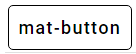
mat-button
The most basic button is the mat button (mat-button). Here’s how you declare it in your HTML:
<button mat-button>Basic</button>And here’s what it looks like (we added a border to it so it is easier to see the actual size of the element):
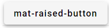
mat-raised-button
A more elegant type of button with a higher average click-through rate is the mat-raised-button. It is declared almost the same way as the basic one but using mat-raised-button instead of mat-button:
<button mat-raised-button>mat-raised-button</button>As you see, this button has a nice shadow effect on it, making it appear raised:
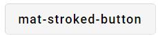
mat-stroked-button
The stroked button is basically a mat-button with a border around it. You make a button stroked by adding mat-stroked-button to it.
<button mat-stroked-button>mat-stroked-button</button>
Here’s what it looks like:
mat-flat-button
The flat button is a clean button type using minimalistic styling. You flatten a button by supplying it with mat-flat-button:
<button mat-flat-button>mat-flat-button</button>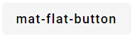
mat-icon Buttons
It is very common for a PWA (Progressive Web App) or responsive application (smartphone, tablet) to use icons instead of text in menus. The reason to use icons instead of text in menus is often to fit the content nicely, independently of which platform you use. Fortunately, you can easily accomplish this by combining a button with a mat-icon.
Here’s an example of how you create a button with a heart icon, using Angular Material:
<button mat-icon-button color="warn" aria-label="Heart icon button example">
  <mat-icon>favorite</mat-icon>
</button>
This is what it looks like:
Here is an example showing a couple of icon buttons with different icons and colors:
<section>
  <div class="example-label">Icon</div>
  <div class="example-button-row">
    <div class="example-flex-container">
      <button
        mat-icon-button
        aria-label="Example icon button with a vertical three dot icon"
      >
        <mat-icon>add_reaction</mat-icon>
      </button>
      <button
        mat-icon-button
        color="primary"
        aria-label="Example icon button with a home icon"
      >
        <mat-icon>home</mat-icon>
      </button>
      <button
        mat-icon-button
        color="accent"
        aria-label="Example icon button with a menu icon"
      >
        <mat-icon>currency_bitcoin</mat-icon>
      </button>
      <button
        mat-icon-button
        color="warn"
        aria-label="Example icon button with a heart icon"
      >
        <mat-icon>favorite</mat-icon>
      </button>
      <button
        mat-icon-button
        disabled
        aria-label="Example icon button with a open in new tab icon"
      >
        <mat-icon>open_in_new</mat-icon>
      </button>
    </div>
  </div>
</section>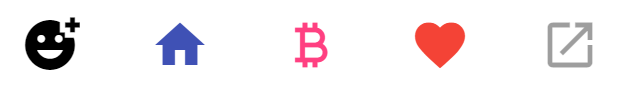
You can set the Angular Material icon button size by defining a new CSS-class, where you put in the width you want for your icon:
.mat-icon-lg {
  transform: scale(2);
}

.mat-icon-md {
  transform: scale(1);
}

.mat-icon-sm {
  transform: scale(0.5);
}
If we now add the different CSS classes to the first three icons we created before, we should see the following result:
mat-fab Buttons
Besides the button types previously demonstrated, Angular Material also offers big rounded buttons, called fab buttons.
Here’s how you create a fab button:
<button mat-fab color="warn" aria-label="Example fab button with a home icon inside it">
  <mat-icon>home</mat-icon>
</button>
This example is the third fab button below. You can set the color and customize your fab buttons as you would normally do with the other types of buttons in Angular Material, there’s no difference.

mat-mini-fab Buttons
There’s also the possibility of adding smaller fab buttons. These smaller fab buttons suit better if you need to create a hamburger- or filter menu for your Angular applications.
You create a mat-mini-fab button the same way as you do with the fab buttons. You only need to use mat-mini-fab instead of the regular mat-fab:
<button mat-mini-fab color="warn" aria-label="Example fab button with a home icon inside it">
  <mat-icon>home</mat-icon>
</button>
Here’s an example of how the mini fab buttons look like:

How to Change Angular Material Button Color
There are a couple of built-in colors for your Angular Material buttons. You can choose from primary, accent, and warning colors.
Here is how you define the different Angular Material button colors and how they look like:
<button mat-button color="primary">Button</button>
<button mat-button color="accent">Accent</button>
<button mat-button color="warn">Warn</button>
Material Angular Button Group
Button groups are often added to websites in the form of radio buttons but sometimes you may want to use the regular buttons Angular Material has to offer. In these particular cases the directive MatButtonToggleGroup
You define the buttons inside MatButtonToggleGroupmat-button-toggle. Here’s how you define a button toggle group using Angular Material:
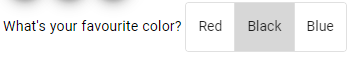
What's your favourite color?
<mat-button-toggle-group name="fontStyle" aria-label="Font Style">
  <mat-button-toggle value="red">Red</mat-button-toggle>
  <mat-button-toggle value="black">Black</mat-button-toggle>
  <mat-button-toggle value="blue">Blue</mat-button-toggle>
</mat-button-toggle-group>
The value parameter is used for interpreting the value when the user chooses that specific option.
Here’s what the button toggle group looks like:
Customizing Angular Material Buttons
It is very easy to customize the color, size, and more on the Angular Material buttons. You can apply your custom styling to them using their CSS classes.
Pro tip: If you don’t know the CSS class for an Angular Material component, a good way of figuring it out is by inspecting them using your browser DevTools:

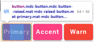
Angular Material Button Custom Color
When you have figured out the CSS class specific to your Angular Material component, then you can set the custom color.
In this example I’ve set the background color of all buttons to yellow-green:
.mdc-button {
  background-color: yellowgreen;
}
And here’s the result:

Angular Material Custom Button Size
The principle of changing the size of your buttons is the same as when we changed the color of them. You can define the custom button sizes when you know the right CSS class to use.
How To Make Angular Material Button Bigger
The main CSS class used by buttons in Angular Material is mdc-button. You can define your own width of the buttons in your stylesheet for that class.
Here’s how you increase the size of your Angular Material buttons:
.mdc-button {
  width: 200px;
}
In this example, I’ve set the width of all buttons to 200 pixels:

How To Make Angular Material Button Smaller
You can set a smaller size for your buttons by applying the same principle as we did when increasing the size.
Here’s how you decrease the size of your Angular Material buttons:
.mdc-button {
  width: 2rem;
}
In this example, I’ve set the width to a small relative width:

Conclusion
Buttons are the most commonly used components in Angular Material. There’s a lot of built-in styling for different types of buttons in Angular Material.
You can easily style your buttons according to the use case and how you want them in your Angular applications.
It is fairly easy to customize the buttons exactly as you want them using CSS if the built-in styling doesn’t suit your specific needs.
Overall, the Angular Material button is a great component that is easy to use and can improve the user experience and elegance of your applications.
That’s all we had to offer in this article about the Angular Material button.
Do you know that we have a collection of free Angular Material tutorials, from the absolute basics to more advanced concepts? You can find the list of our Angular Material tutorials here.
Thanks for some other informative site. The place
else may I get that kind of info written in such a perfect means?
I’ve a venture that I’m simply now running on, and I’ve been on the
glance out for such info.