
You will in this tutorial learn the basics about Angular Material inputs.
I will list the inputs that Angular Material supports and provide guidance on starting with it.
I recommend you to check out this page if you’re interested in learning more about Angular Material, Getting Started With Angular Material. You’ll find all our tutorials on Angular Material there.
Type of Inputs
Since multiple input types exist in HTML you may wonder which input types Angular Material support. Angular Material support the following input types:
- Color
- date
- datetime-local
- month
- number
- password
- search
- tel
- text
- time
- url
- week
You can also find this list in the official documentation for Angular Material, you can find it here.
How To Use Angular Material Inputs
Now that you have an understanding of the supported input types in Angular Material, let’s dive into their practical usage. I will demonstrate a great example that utilizes text inputs together with hints and validation, giving you a hands-on experience of working with inputs alongside Angular Material.
Email Input
Let’s say we have a simple input that expects the user to type in their email address, like this:
<input type="email" placeholder="Email address"/>Creating Our Angular Material Input
In order to use our input element with Angular Material, we need to add the matInput directive to it:
<input type="email" placeholder="Email address" matInput/>Notice that we’ve added the matInput directive to the input element. The matInput directive is part of the Angular Material library and it provides various enhancements to the input, like animations and validations.
To display a hint and helpful label on the input we can leverage the matInput directive along with the matHint and matLabel components, like this:
<mat-form-field>
  <mat-label>Email Address</mat-label>
  <input type="email" matInput />
  <mat-hint>Use a valid email</mat-hint>
</mat-form-field>Note that you need to encapsulate it with a mat-form-field in order for it to work properly.
If we now run our application, we see this:
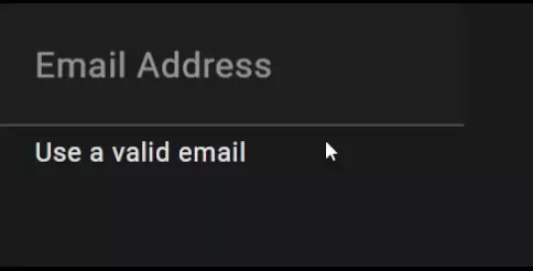
Looks pretty good, right?
Adding Validation And Error Message
So, we have an input which let’s the user type in their email address. The next step from here is to add validation to it, which should notify the user if the given email address is invalid.
The first thing we should do is create the FormControl object in our Angular component. This is easily done by adding this line:
email = new FormControl("", [Validators.required, Validators.email]);Since this example will feature a reactive form, we also need to import the module ReactiveFormsModule into our module and add it to the import array:
import { NgModule } from "@angular/core";
import { BrowserModule } from "@angular/platform-browser";
import { AppRoutingModule } from "./app-routing.module";
import { AppComponent } from "./app.component";
import { MatFormFieldModule } from "@angular/material/form-field";
import { MatInputModule } from "@angular/material/input";
import { ReactiveFormsModule } from "@angular/forms";

@NgModule({
  declarations: [AppComponent],
  imports: [
    BrowserModule,
    AppRoutingModule,
    MatFormFieldModule,
    MatInputModule,
    ReactiveFormsModule,
  ],
  providers: [],
  bootstrap: [AppComponent],
})
export class AppModule {}
Now, we can bind the FormControl object we created in app.component.ts with our input element. This will make the input field validate that the email is matching WHATWG’s valid email pattern. We also add the matError component, which will be visible if the email is invalid:
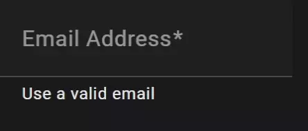
<mat-form-field>
  <mat-label>Email Address</mat-label>
  <input type="email" matInput required [formControl]="email" />
  <mat-hint>Use a valid email</mat-hint>
  <mat-error>Email is invalid 🔴</mat-error>
</mat-form-field>This is what we have so far:
A good idea would be to use the matHint component to display if the email is valid. Let’s replace the content inside the mat-hint element:
<mat-form-field>
  <mat-label>Email Address</mat-label>
  <input type="email" matInput required [formControl]="email" />
  <mat-hint>Email is valid 🟢</mat-hint>
  <mat-error>Email is invalid 🔴</mat-error>
</mat-form-field>This looks good but there’s one issue left that we need to solve, our application is saying Email is valid 🟢 even if the input field is empty. We can quickly solve this by adding an ngIf statement to our mat-hint element.
We will create a custom validator function that validates the following:
- Does the email contain an
@(at) - Does the email contain a
.(dot) - Is the
.(dot) after the@(at) - Are there characters after the
.(dot)
Here is what our custom validator looks like:
isEmailValid(): boolean {
    const isEmailContainingDotAfterAt =
      (this.email.value?.indexOf(".") ?? 0) >
      (this.email.value?.indexOf("@") ?? 0) + 1;

    const isDotNotLastChar =
      this.email.value?.indexOf(".") !== (this.email.value?.length ?? 0) - 1;

    return (isEmailContainingDotAfterAt && isDotNotLastChar) ?? false;
}And lastly, let’s add the ngIf statement to our mat-hint element:
<mat-form-field>
  <mat-label>Email Address</mat-label>
  <input type="email" matInput required [formControl]="email" />
  <mat-hint *ngIf="isEmailValid()">Email is valid 🟢</mat-hint>
  <mat-error>Email is invalid 🔴</mat-error>
</mat-form-field>And, voila! Here’s the final result:

Bonus: Show Different Errors Depending On State
A nice little feature we can do to further improve our example is to show different error messages depending on the state of the input.
In order to show different error messages depending on the state of the input we need a function for determining it. Add the following function to your component:
getErrorMessage() {
    if (this.email.hasError("required")) {
      return "You must enter a value";
    }
    return this.email.hasError("email") ? "Not a valid email" : "";
}This function can now be called from inside the mat-error element:
<mat-form-field>
  <mat-label>Email Address</mat-label>
  <input type="email" matInput required [formControl]="email" />
  <mat-hint *ngIf="isEmailValid()">Email is valid 🟢</mat-hint>
  <mat-error>{{ getErrorMessage() }}</mat-error>
</mat-form-field>Here’s the result:
Conclusion
In conclusion, Angular Material Inputs provide a powerful and user-friendly solution for dealing with input fields in Angular applications. Throughout this article, we learned about the supported input types and got an understanding of how they are used together with Angular Material.
By leveraging Angular Material Inputs, developers can easily create forms and improve the user experience of their websites. The integration of validators and the ability to display hints add another layer of functionality and guidance for the users.
Angular Material Inputs is just one of many articles we have on Angular Material, so we encourage you to check out the rest. Here are a bunch of tutorials and resources on Angular Material so you can learn everything about it.