Discover how to seamlessly integrate stylish and attention-grabbing notifications into your Angular applications using Angular Material.
In this short but concise tutorial, we’ll delve into the essentials of implementing notifications, referred to as snackbar in Angular Material. Learn how to show notifications, customize their position, and set their display duration, and also how to create custom snackbars and inject data into them.
Sounds interesting? Well, keep scrolling to learn about it!
A Brief Introduction to Notifications
Notifications in web applications first gained widespread adoption with the introduction of the Web Notifications API, which was standardized and implemented in modern web browsers around 2012-2013. This API allowed web developers to display system-level notifications on desktop and mobile devices, similar to native mobile apps. However, it’s worth noting that notifications, in a more basic form, were used earlier through techniques like pop-up windows or custom JavaScript alerts.
Toast vs Notification
If you’re a web developer, you have probably stumbled upon the term Toast.
I know a lot of web developers get confused about whether or not toasts and regular notifications are the same. They’re both used to display information to the users but they differ in terms of their usage.
Here’s the difference between a toast and a regular notification:
- Notifications are typically used to convey important or time-sensitive information to the user. They can appear as pop-up windows, banners, or system-level alerts.
- Toasts, also known as snackbars, are typically used to provide short, non-intrusive feedback or updates. As opposed to regular notifications, they’re meant to be less obtrusive and disruptive to the user experience (smaller in size and often visible for a shorter amount of time).
Now I feel that we’ve talked enough about theoretical stuff, it’s time to dig into the heart of this tutorial: the practical examples and their implementations.
Showing a Basic Snackbar Using Angular Material
To kick off the examples, we’ll guide you through the process of creating an application that features a button that triggers notifications when clicked. Without further ado, let’s get into it!
In order to use the snackbars included in Angular Material, we first need to make sure to include MatSnackBarModule in our application module:
import { MatSnackBarModule } from "@angular/material/snack-bar";

...

@NgModule({
  ...
  imports: [
    ...
    MatSnackBarModule,
  ]
}Next, I generated a separate component, notifications.component.ts , where I’ll experiment with snackbars. Make sure to import and inject the MatSnackBar service from Angular Material:
import { Component } from "@angular/core";
import { MatSnackBar } from "@angular/material/snack-bar";

@Component({
  selector: "app-notification",
  templateUrl: "./notification.component.html",
})
export class NotificationComponent {
  constructor(public notification: MatSnackBar) {}
}
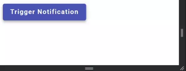
As mentioned earlier regarding the HTML, the button will simply trigger a simple snackbar notification when clicked. Here’s the HTML for this example:
<button mat-raised-button color="primary" (click)="openNotification()">
  Trigger Notification
</button>You may notice that we call the function openNotification on clicks. This function doesn’t exist in our component so let’s create it:
openNotification() {
  this.notification.open("This is a notification", undefined, {
    duration: 1500,
  });
}This is the result:
How to Set Snackbar Position
Let’s continue building on the previous example and set the snackbars position.
In order to set the position of our notification we’ll need to expand the object we send in as the third parameter to the open() function:
openNotification() {
    this.notification.open("This is a notification", undefined, {
      duration: 1500,
      verticalPosition: "top",
      horizontalPosition: "center",
    });
}This sets the position of the notification to the top center:

The MatSnackBarConfig Class
The class in which we defined the position of the snackbar is of the type MatSnackBarConfig.
Besides setting the position and duration of the notification, the MatSnackBarConfig class also includes properties for injecting data into the container, defining the direction of the text inside it, and which view container should act as parent to it.
Here is a link to the definition of the class!
How to Inject Data into a Custom Snackbar
Now, let’s create a new component that functions as a snackbar. This component will take in a string and then display it:
import { Component, Inject } from "@angular/core";
import { MAT_SNACK_BAR_DATA } from "@angular/material/snack-bar";

@Component({
  selector: "app-custom-notification",
  template: ` <div class="container">
    <h1>{{ data }}</h1>
  </div>`,
  styles: [
    `
      h1 {
        font-size: 42px;
      }

      .container {
        display: flex;
        justify-content: center;
        align-items: center;
      }
    `,
  ],
})
export class CustomNotificationComponent {
  constructor(@Inject(MAT_SNACK_BAR_DATA) public data: string) {}
}
Besides injecting and displaying the string, I added some styling that centers it inside the snackbar.
We can inject data into a snackbar through the Data property inside the MatSnackBarConfig object.
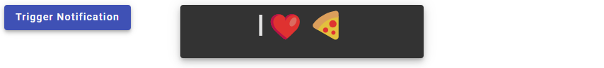
Here’s how you would, for example, inject a string containing the text “I❤️🍕” and then display it inside a custom snackbar:
openNotification() {
    this.notification.openFromComponent(CustomNotificationComponent, {
      data: "I❤️🍕",
      duration: 1500,
      verticalPosition: "top",
      horizontalPosition: "center",
    });
}And voila! Here’s the final result:
Conclusion
In this concise and easy-to-follow tutorial, we’ve explored the fundamentals of how to add notifications to our Angular applications using the Angular Material Snackbar.
From displaying a basic notification and adjusting its position to setting duration and creating custom snackbars with injected data, we covered the fundamentals of what you can do with the Angular Material Snackbar.
With the knowledge gained from following this tutorial, you can easily implement user-friendly and customizable notifications in your Angular applications.
Keep coding and stay tuned for more amazing Angular Material articles and tutorials!
Did you enjoy following this tutorial about the Angular Material Snackbar? You should stop by here and scroll through our other Angular Material tutorials.