Are you interested in learning everything about tables in Angular Material?
This tutorial will guide you through how to create tables for your web application using Angular Material, these tables look good and brings a nice touch to your applications.
Besides learning the basics, we’ll also dive into how to adjust the styling and data visualization on the tables.
Does this sound like something interesting? Keep scrolling to learn more about it.
How To Create Tables Using Angular Material
The first thing we need to do before we can add a bunch of tables to our application is to import and include the module MatTableModule, that’s what we’ll do in our module app.module.ts:
import { MatTableModule } from "@angular/material/table";

...

 imports: [
    MatTableModule,
],After we have imported the MatTableModule module, we can create our first table using Angular Material.
Defining The Structure of The Table
A good thing to do early on when creating tables is to define the structure of it, like header, column names, and so on:
<table mat-table>
  <!--- Note that these columns can be defined in any order.
          The actual rendered columns are set as a property on the row definition" -->

  <!-- Position Column -->
  <ng-container matColumnDef="name">
    <th mat-header-cell *matHeaderCellDef>Name</th>
    <td mat-cell *matCellDef="let stock">{{ stock.name }}</td>
  </ng-container>

  <!-- Name Column -->
  <ng-container matColumnDef="ticker">
    <th mat-header-cell *matHeaderCellDef>Ticker</th>
    <td mat-cell *matCellDef="let stock">{{ stock.ticker }}</td>
  </ng-container>

  <!-- Weight Column -->
  <ng-container matColumnDef="price">
    <th mat-header-cell *matHeaderCellDef>Price</th>
    <td mat-cell *matCellDef="let stock">${{ stock.price }}</td>
  </ng-container>

  <tr mat-header-row *matHeaderRowDef="displayedColumns"></tr>
  <tr mat-row *matRowDef="let row; columns: displayedColumns"></tr>
</table>
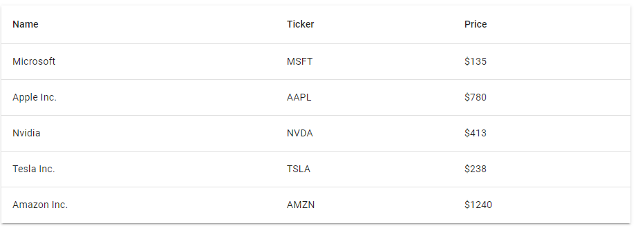
In this example, we’ll display some company stocks with their tickers and price (only dummy data to keep this example straightforward).
Creating Model and Dummy Data
Now, that we have our table structure in place we can focus on creating the model and defining the data.
The first thing we’ll do is create the model for our stocks:
export interface Stock {
  ticker: string;
  name: string;
  price: number;
}
Next, we’ll create a list in our component containing some dummy data and also define the column names for our table:
import { Component } from "@angular/core";
import { Stock } from "./stock.model";

@Component({
  selector: "app-table",
  templateUrl: "./table.component.html",
  styles: [],
})
export class TableComponent {
  displayedColumns: string[] = ["name", "ticker", "price"];
  dataSource: Stock[] = [
    { name: "Microsoft", ticker: "MSFT", price: 135 },
    { name: "Apple Inc.", ticker: "AAPL", price: 780 },
    { name: "Nvidia", ticker: "NVDA", price: 413 },
    { name: "Tesla Inc.", ticker: "TSLA", price: 238 },
    { name: "Amazon Inc.", ticker: "AMZN", price: 1240 },
  ];
}Displaying the Data in Our Table
For us to display the data in our table, we only need to set the property dataSource on our table element:
<table mat-table [dataSource]="dataSource">
  <!--- Note that these columns can be defined in any order.
          The actual rendered columns are set as a property on the row definition" -->

  <!-- Position Column -->
  <ng-container matColumnDef="name">
    <th mat-header-cell *matHeaderCellDef>Name</th>
    <td mat-cell *matCellDef="let stock">{{ stock.name }}</td>
  </ng-container>

  <!-- Name Column -->
  <ng-container matColumnDef="ticker">
    <th mat-header-cell *matHeaderCellDef>Ticker</th>
    <td mat-cell *matCellDef="let stock">{{ stock.ticker }}</td>
  </ng-container>

  <!-- Weight Column -->
  <ng-container matColumnDef="price">
    <th mat-header-cell *matHeaderCellDef>Price</th>
    <td mat-cell *matCellDef="let stock">${{ stock.price }}</td>
  </ng-container>

  <tr mat-header-row *matHeaderRowDef="displayedColumns"></tr>
  <tr mat-row *matRowDef="let row; columns: displayedColumns"></tr>
</table>
You may notice I also added the class mat-elevation-z2 to our table element. This class will elevate our container by 2 pixels, you can read more about How To Work With Elevation in Angular Material and the official documentation here!
Result
Now, run the application with the following command:
npm startAnd you should see the following result:

Create a Table with Pagination Support
You may often want to create tables containing data split between multiple pages. Fortunately, Angular Material has pagination support for tables.
Let’s continue building on the previous example. In order to enable pagination support for our table, we’ll need to import the module MatPaginatorModule:
import { MatPaginatorModule } from "@angular/material/paginator";

...

imports: [
  MatPaginatorModule,
],That’s all we’ve to do in our module, now it’s time to jump back into our component again!
Enable Pagination on Our Table
Previously we could use our own model (stock.model.ts) as a data source since we didn’t need any particular functionality, we just wanted to display our data in a nice-looking table.
This time we want to enable the pagination functionality on our table, therefore we need to use the featured class, MatTableDataSource. This is an extensive class included in Angular Material for the purpose of simplifying working with tables. Here’s what our dataSource definition looks like now:
import { Component} from "@angular/core";
import { Stock } from "./stock.model";
import { MatTableDataSource } from "@angular/material/table";

@Component({
  selector: "app-table",
  templateUrl: "./table.component.html",
  styles: [],
})
export class TableComponent {
  displayedColumns: string[] = ["name", "ticker", "price"];
  dataSource = new MatTableDataSource<Stock>([
    { name: "Microsoft", ticker: "MSFT", price: 135 },
    { name: "Apple Inc.", ticker: "AAPL", price: 780 },
    { name: "Nvidia", ticker: "NVDA", price: 413 },
    { name: "Tesla Inc.", ticker: "TSLA", price: 238 },
    { name: "Amazon Inc.", ticker: "AMZN", price: 1240 },
  ]);
}
But, we’re not done yet. In order for us to use the pagination functionality in Angular Material, we’ll need to inject MatPaginator as a ViewChild and then set the data source paginator to the injected MatPaginator:
import { Component, ViewChild } from "@angular/core";
import { Stock } from "./stock.model";
import { MatPaginator } from "@angular/material/paginator";
import { MatTableDataSource } from "@angular/material/table";

@Component({
  selector: "app-table",
  templateUrl: "./table.component.html",
  styles: [],
})
export class TableComponent {
  @ViewChild(MatPaginator) paginator!: MatPaginator;

  ngAfterViewInit() {
    this.dataSource.paginator = this.paginator;
  }

  displayedColumns: string[] = ["name", "ticker", "price"];
  dataSource = new MatTableDataSource<Stock>([
    { name: "Microsoft", ticker: "MSFT", price: 135 },
    { name: "Apple Inc.", ticker: "AAPL", price: 780 },
    { name: "Nvidia", ticker: "NVDA", price: 413 },
    { name: "Tesla Inc.", ticker: "TSLA", price: 238 },
    { name: "Amazon Inc.", ticker: "AMZN", price: 1240 },
  ]);
}
Now, as a last thing, we can add a mat-paginator to our HTML:
<table mat-table [dataSource]="dataSource" class="mat-elevation-z2">
  <!--- Note that these columns can be defined in any order.
          The actual rendered columns are set as a property on the row definition" -->

  <!-- Position Column -->
  <ng-container matColumnDef="name">
    <th mat-header-cell *matHeaderCellDef>Name</th>
    <td mat-cell *matCellDef="let stock">{{ stock.name }}</td>
  </ng-container>

  <!-- Name Column -->
  <ng-container matColumnDef="ticker">
    <th mat-header-cell *matHeaderCellDef>Ticker</th>
    <td mat-cell *matCellDef="let stock">{{ stock.ticker }}</td>
  </ng-container>

  <!-- Weight Column -->
  <ng-container matColumnDef="price">
    <th mat-header-cell *matHeaderCellDef>Price</th>
    <td mat-cell *matCellDef="let stock">${{ stock.price }}</td>
  </ng-container>

  <tr mat-header-row *matHeaderRowDef="displayedColumns"></tr>
  <tr mat-row *matRowDef="let row; columns: displayedColumns"></tr>
</table>

<mat-paginator
  [pageSizeOptions]="[2, 5, 10, 20]"
  showFirstLastButtons
  class="mat-elevation-z2"
>
</mat-paginator>
Result
Here’s the final result of our table with pagination functionality. All the functionality and styling of the paginator, without creating a single component or adding any custom styling. Pretty neat, right?

Creating Tables with Sticky Headers and Footers
Using Angular Material, it is very easy to make the header or footer of a table sticky.
Basically, you define if a mat-header-row or mat-footer-row should be sticky by setting just one property, sticky:
<table mat-table [dataSource]="dataSource" class="mat-elevation-z2">
  <!--- Note that these columns can be defined in any order.
          The actual rendered columns are set as a property on the row definition" -->

  <!-- Position Column -->
  <ng-container matColumnDef="name">
    <th mat-header-cell *matHeaderCellDef>Name</th>
    <td mat-cell *matCellDef="let stock">{{ stock.name }}</td>
  </ng-container>

  <!-- Name Column -->
  <ng-container matColumnDef="ticker">
    <th mat-header-cell *matHeaderCellDef>Ticker</th>
    <td mat-cell *matCellDef="let stock">{{ stock.ticker }}</td>
  </ng-container>

  <!-- Weight Column -->
  <ng-container matColumnDef="price">
    <th mat-header-cell *matHeaderCellDef>Price</th>
    <td mat-cell *matCellDef="let stock">${{ stock.price }}</td>
  </ng-container>

  <tr mat-header-row *matHeaderRowDef="displayedColumns; sticky: true"></tr>
  <tr mat-row *matRowDef="let row; columns: displayedColumns"></tr>
</table>

<mat-paginator
  pageSize="20"
  [pageSizeOptions]="[2, 5, 10, 20]"
  showFirstLastButtons
  class="mat-elevation-z2"
>
</mat-paginator>
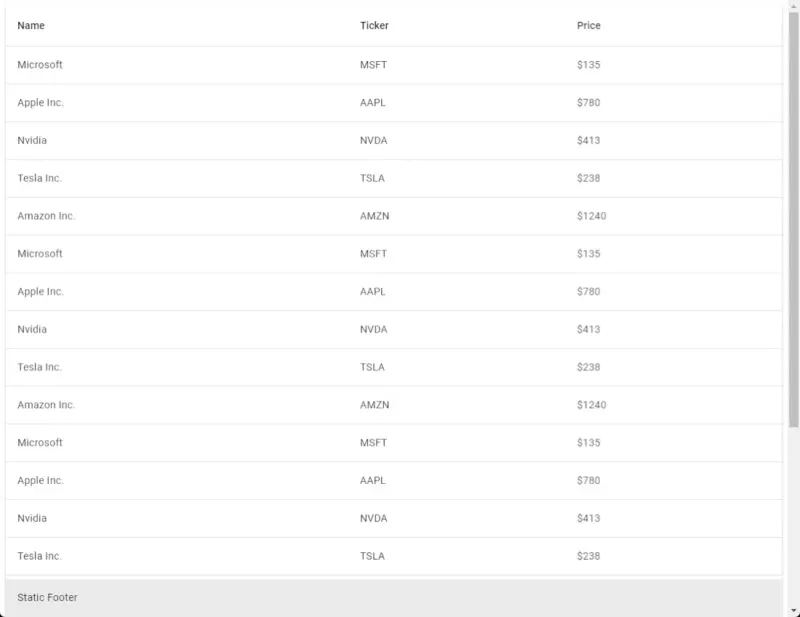
If we now add some more rows to our data source and then run our application we get this output:

It’s the same for table footers, you specify the sticky property:
<tr mat-footer-row *matFooterRowDef="displayedColumns; sticky: true"></tr>Here’s what the table looks like when I set the footer to sticky:

Conclusion
In conclusion, we covered all these concepts in this tutorial:
- How To Create Tables Using Angular Material
- How To Add Pagination Support
- How To Make Table Header and Table Footer Sticky
There’s still much more to learn about tables in Angular Material but I felt that the length of this tutorial seemed good…
Still interested in learning more about Angular Material? You can find a list of all our Angular Material tutorials here.

