Tooltips are nifty little containers often used to show helpful text or information to the user when they hover or click on a button.
This short tutorial will show you how to use Angular Material tooltips in your Angular application. Without babbling on about what tooltips are, let’s instead get right into the practicality of actually using tooltips in your Angular application.
How to Use Angular Material Tooltips
First, we’ll import the MatTooltipModule from Angular Material into our Angular module:
import { MatTooltipModule } from "@angular/material/tooltip";

...

imports: [
  ...
  MatTooltipModule,
],After we have imported MatTooltipModule, we can add a tooltip to an element, like a button:
<button
      mat-raised-button
      matTooltip="This button does not do anything except showing this tooltip"
      aria-label="Button which does not do anything except displaying a tooltip when
 focused or hovered over"
  >
      This is a button
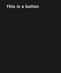
</button>This is how the example looks like when you hover over it:

That’s almost all there is to it! Next up, we’ll take a look at how we can set the position of the tooltip, setting it to a disabled state and toggle it’s visibility from an event on another element.
How to Set Angular Material Tooltip Position
It is very easy to set the position of your tooltips using Angular Material. If we use the button and tooltip from the previous example, we’ll only need to add and define one property in our button element.
In order to set the tooltip position using Angular Material, you only need to add the matTooltipPosition property to your button, like this:
<button
      mat-raised-button
      matTooltip="This button does not do anything except showing this tooltip"
      aria-label="Button which does not do anything except displaying a tooltip when focused or hovered over"
      matTooltipPosition="right"
    >
      This is a button
</button>Here’s how it looks like when we run our application:

Disabling Angular Material Tooltip
If you for some reason want to completely disable the popup, you can add the property matTooltipDisabled to it.
It is also possible to toggle the tooltips disability using Angulars built-in attribute binding:
@Component({
  selector: "app-tooltip",
  template: `
    <button
      mat-raised-button
      matTooltip="This button does not do anything except showing this tooltip"
      aria-label="Button which does not do anything except displaying a tooltip when focused or hovered over"
      matTooltipPosition="right"
      [matTooltipDisabled]="isDisabled"
    >
      This is a button
    </button>
  `,
  styles: [],
})
export class TooltipComponent {
  isDisabled: boolean = true;
}Toggling Tooltips From External Elements
One of the great features of using tooltips from Angular Material is that it’s possible to trigger their functionality from other elements by calling the tooltip methods (show, hide, toggle).
If we use the example we’ve already created, we only need to add a reference ID to it. This is needed in order for us to refer to it from other elements:
<button
      #tooltipBtn="matTooltip"
      mat-raised-button
      matTooltip="This button does not do anything except showing this tooltip"
      aria-label="Button which does not do anything except displaying a tooltip when focused or hovered over"
      matTooltipPosition="right"
      [matTooltipDisabled]="isDisabled"
    >
      This is a button
</button>We can now add another button to our application which calls the toggle method when we click on it:
<button
      #tooltipBtn="matTooltip"
      mat-raised-button
      matTooltip="This button does not do anything except showing this tooltip"
      aria-label="Button which does not do anything except displaying a tooltip when focused or hovered over"
      matTooltipPosition="right"
      [matTooltipDisabled]="isDisabled"
    >
      This is a button
    </button>

    <br />
    <button mat-raised-button color="primary" (click)="tooltipBtn.toggle()">
      Toggle tooltip
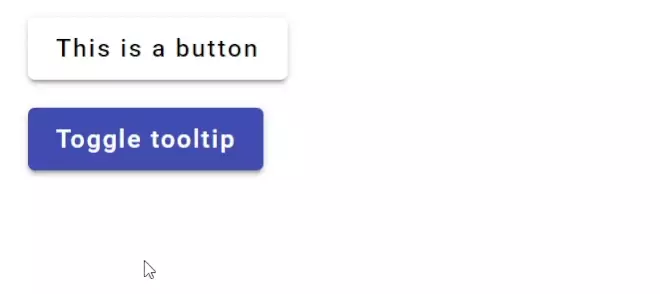
</button>Voila! Here’s the final result (Note: I added a 0.5rem margin to the buttons so the example looks a bit better):

Conclusion
This tutorial have showed you how you can easily add tooltips to your Angular applications using Angular Material.
We demonstrated how easy it is to set the position of the tooltips, how to disable them and also how to trigger their events from other elements.
If you’re interested in learning more about Angular Material, we’ll recommend you to check out our other articles. You can find a list of all our other basic Angular Material tutorials here!

