Besides offering a lot of ready-to-use components such as buttons, dropdowns, cards, tables, and more. Angular Material also provides predefined CSS classes for adding depth to your components, called Elevation Helpers.
In this article, we’ll cover everything you need to know about Angular Material Elevation so you’ll be able to give all your components in your Angular applications that popping 3D vibe.
Elevation Explained
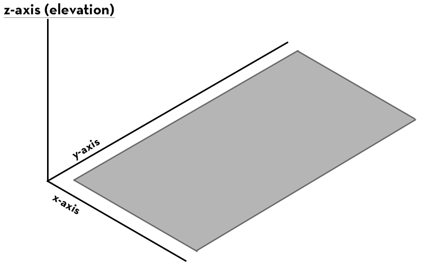
Elevation is the relative distance between two surfaces along the z-axis. In Angular Material (and a lot of other web design libraries) this effect is accomplished by adding shadow to the components of your application. The amount of shadow varies depending on in which order you want your components to be on the z-axis.
Measuring Elevation In Angular Material
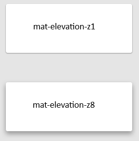
The measurement used for elevation in Angular Material is dps (density-independent pixels). The more dps your component’s shadow has, the more it’ll pop out.
Below is an example illustrating the difference between a card having the mat-elevation-z1 class (1dp shadow) and a card having the mat-elevation-z8 class (8dp shadow).
What Is the Difference Between Shadow and Elevation
I understand why this question gets asked quite often. In order to create an elevation effect in your application which uses Angular Material, you’ll probably apply shadow on your components and elements.
Even though the common solution is to apply shadow to your components and elements, Elevation can also be depicted by using other visual effects, such as varying opacity or clear color contrasts between elements.
How to Define Elevation in Angular Material
It is very easy to add elevation to your Angular application if you’re using Angular Material.
In order to add elevation to an element in your application, you just need to add one of the elevation CSS classes provided in Angular Material.
All the elevation CSS classes follow this naming:
mat-elevation-z# //where # is the dps you want on your elevation.What Are the Levels of Elevation in Angular Material
Angular Material offers 25 levels of elevation depth, ranging from 0 to 24, and all the elevation classes in Angular Material use the CSS property box-shadow.
Angular Elevation Example
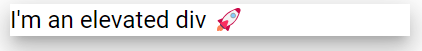
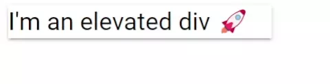
There’s really not much to show on how to add elevation to your elements if you’re using Angular Material, you just add the CSS class you want, like this:
<div class="mat-elevation-z16">
  <h1>I'm an elevated div 🚀</h1>
</div>
And here’s the result:
Animated Elevation
An example that is a bit cooler than just adding a static elevation class to your element is to change elevation with a transitional effect on it.
Consider the previous example above but instead of using the built-in CSS class we’ll create a new CSS class:
@use "@angular/material" as mat;

.my-elevation {
  @include mat.elevation-transition();
  @include mat.elevation(2);
  width: 256px;

  &:hover {
    @include mat.elevation(8);
  }
}
Now that we have our CSS class in place, let’s use it on the div from the previous example:
<div class="my-elevation">
  <h1>I'm an elevated div 🚀</h1>
</div>
And voila! Here’s the result:
Conclusion
In conclusion, using the built-in elevation CSS classes in Angular Material is a great way of adding more depth to your Angular applications.
As you have seen in this article, it is easy to add elevation to your application’s elements by using Angular Material.
Do you know we have a bunch of other articles and tutorials about Angular Material? If you’re interested in learning more about Angular Material, check out the list of tutorials here.