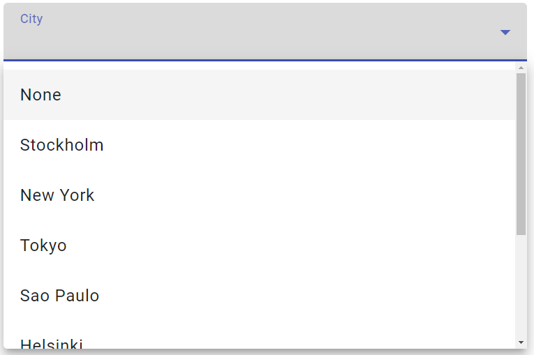
So, you’re probably already familiar with Angular Material and their mat-select component. We will in this tutorial show you how you can extend the mat-select component with a search filter.
Does this sound interesting? Keep scrolling to find out how to implement the Angular Material select with search filter.
Prerequisites
Before we get started, there’s some obvious stuff that needs to be in place (you can skip this section if you already have an Angular project with Angular Material installed):
- An Angular project (preferably using the latest Angular version)
- Angular Material installed for the Angular project
If you don’t have an Angular project with Angular Material in place, you can generate it with these commands:
ng new mat-select-search --minimal --routing=false --style=scss --inline-template=falseAfter the Angular project has been generated, you can add Angular Material to it:
ng add @angular/materialYou will be presented with a couple of options when adding Angular Material. We’ll go with the default options in this tutorial.
Import the Required Angular Material Components
Let’s start by importing the Angular Material components we’ll be using in this tutorial. We’ll import them into our app module:
import { NgModule } from "@angular/core";
import { BrowserModule } from "@angular/platform-browser";

import { AppComponent } from "./app.component";
import { BrowserAnimationsModule } from "@angular/platform-browser/animations";

import { FormsModule } from "@angular/forms";
import { MatFormFieldModule } from "@angular/material/form-field";
import { MatSelectModule } from "@angular/material/select";
import { MatInputModule } from "@angular/material/input";

@NgModule({
  declarations: [AppComponent],
  imports: [
    BrowserModule,
    BrowserAnimationsModule,
    FormsModule,
    MatFormFieldModule,
    MatSelectModule,
    MatInputModule,
  ],
  providers: [],
  bootstrap: [AppComponent],
})
export class AppModule {}
That’s all we have to do in our app module. Next up, we’ll add the HTML needed for us to demonstrate the functionality.
Add HTML for Our mat-select Component
We will create a dropdown containing different cities the user can choose from. First, let’s add the MatFormField component to our HTML:
<mat-form-field>
  <mat-label>City</mat-label>
  <mat-select>
    <mat-option>None</mat-option>
  </mat-select>
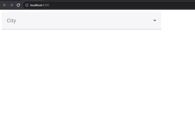
</mat-form-field>So far, this is what your application should look like if you run it:

Let’s go ahead and add some more data to our component, which can be populated into our dropdown:
import { Component } from "@angular/core";

@Component({
  selector: "app-root",
  templateUrl: "./app.component.html",
  styles: [],
})
export class AppComponent {
  title = "mat-select-search";

  city: string[] = [
    "Stockholm",
    "New York",
    "Tokyo",
    "Sao Paulo",
    "Helsinki",
    "Tallin",
    "San Francisco",
    "Los Angeles",
  ];
  selectedCities = this.city;
}Now, we can add all that data to our dropdown. Let’s update our HTML so we include the cities we just added to our component:
<mat-form-field>
  <mat-label>City</mat-label>
  <mat-select>
    <mat-option>None</mat-option>
    <mat-option *ngFor="let city of selectedCities" [value]="city">{{city}}</mat-option>
  </mat-select>
</mat-form-field>
mat-select With Search Filter Example
So, we have our dropdown in place and it is populated with all the data we need. Our next step is to add the search filter to the dropdown.
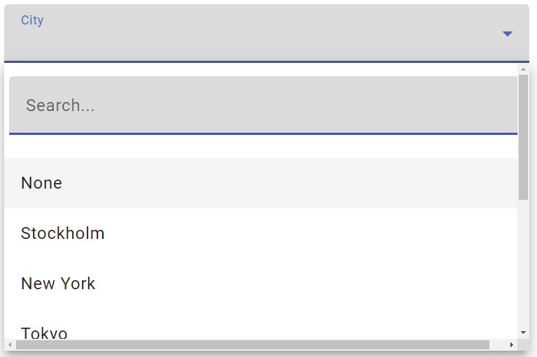
In order to fit the search filter inside the mat-select component, we’ll need to add a mat-form-field containing an input element inside the mat-select component, like this:
<mat-form-field>
  <mat-label>City</mat-label>
  <mat-select>
    <mat-form-field>
      <input
        matInput
        placeholder="Search..."
        (keyup)="onKey($event.target)"
      />
    </mat-form-field>
    <mat-option>None</mat-option>
    <mat-option *ngFor="let city of selectedCities" [value]="city">{{
      city
    }}</mat-option>
  </mat-select>
</mat-form-field>Notice, I’ve added a (keyup) event and a class to our input element. The (keyup) event will call the function onKey which we’ll add next.
This is how your application should look now:

Add Search Filter Function
We’re done with the HTML, what’s left to do is create the onKey and search functions.
Let’s start with the search function:
search(value: string) {
    let filter = value.toLowerCase();
    return this.city.filter((option) =>
      option.toLowerCase().startsWith(filter)
    );
}This function will filter out all values in our array which doesn’t start with the text you type in the search input field and return the matching strings.
Our next function (onKey) will basically set our local array (selectedCities) to the array returned from the search function:
onKey(eventTarget: any) {
    this.selectedCities = this.search(eventTarget.value);
}The input to the onKey function is sent from the input element.
Final Result
If you’ve followed the steps outlined in this tutorial, you should see the following result if you run your application:

If you do, congratulations! You just created an Angular Material select with search filter.
Conclusion
To summarize this tutorial, it’s easy to add search filter functionality to the mat-select component in Angular Material.
I’ve seen a lot of other developers solve this issue by using other third-party libraries but since you have all the tools you need in Angular and Angular Material, why not solve it with those tools? Why complicate things by bringing in more libraries?
This was a short tutorial on how to add a search filter to a dropdown in Angular Material. Are you interested in learning more about Angular Material? Check out our list of tutorials here!


I am really imprdssed together with your writing skills as well as
with the fprmat to your blog. Is that this a paid subject matter or
did you customize it yourself? Anyway keep up the
excellent quality writing, it’s uncommon to peer a great blog like this one today..
My web-site … https://mostbet-casino.mystrikingly.com