This tutorial will cover how to get started working with checkboxes using Angular Material and also give you a few examples showcasing checkboxes, their styling and functionality.
Getting Started Using Angular Material Checkboxes
As you have seen before, if you’ve read our other tutorials on Angular Material, it is very easy to get started using Angular Material components, it’s the same with checkboxes.
In order to add checkboxes to your website, you’ll only need to import MatCheckboxModule to your Angular module:
import { NgModule } from "@angular/core";
import { BrowserModule } from "@angular/platform-browser";
import { AppRoutingModule } from "./app-routing.module";
import { AppComponent } from "./app.component";
import { BrowserAnimationsModule } from "@angular/platform-browser/animations";
import { MatCheckboxModule } from "@angular/material/checkbox";

@NgModule({
  declarations: [AppComponent],
  imports: [
    BrowserModule,
    AppRoutingModule,
    BrowserAnimationsModule,
    MatCheckboxModule,
  ],
  providers: [],
  bootstrap: [AppComponent],
})
export class AppModule {}
That’s it! You can now add great-looking checkboxes to your website or application, all with the help of Angular Material.
To add a checkbox to your website, you use the <mat-checkbox> element. The label of the checkbox will be the content you put in between <mat-checkbox> and </mat-checkbox>
<mat-checkbox class="example-margin">I Like Cats 😸</mat-checkbox>This is how the checkbox we just added looks like:

Next up, we’ll take a look at the different states the checkbox can have.
Angular Material Checkbox States
A checkbox in Angular Material can have multiple states. We will go through each state in this section. Do you want to read the official API documentation on checkboxes? You can find it here.
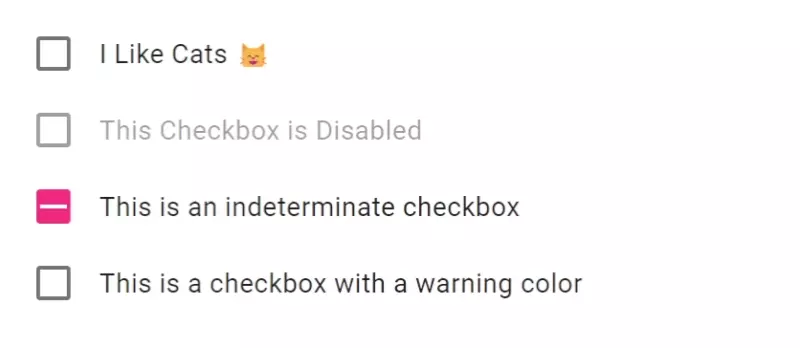
We have already showcased the checked state in our previous example. There is two more states which exist on the checkbox; disabled and indeterminate.
Here’s an example showcasing all checkbox states:
<style>
  .container {
    display: flex;
    flex-direction: column;
  }
</style>

<div class="container">
  <mat-checkbox class="example-margin">
    I Like Cats 😸
  </mat-checkbox>

  <mat-checkbox class="example-margin" [disabled]="true">
    This Checkbox is Disabled
  </mat-checkbox>

  <mat-checkbox class="example-margin" [indeterminate]="true">
    This is an indeterminate checkbox
  </mat-checkbox>

  <mat-checkbox class="example-margin" color="warn">
    This is a checkbox with a warning color
  </mat-checkbox>
</div>
This is how the checkboxes look like if we run our Angular application:

Accessibility
If you want to make sure your whole website or application is following the best accessibility principles you may wonder if the checkbox component in Angular Material is accessible. I have good news for you, Angular Material Checkbox comes with built-in accessibility features, ensuring that your web applications are accessible by default.
There’s no need to worry about adding accessibility implementations since Angular Material takes care of it.
Conclusion
In conclusion, this short Angular Material Checkbox tutorial have explained how to get started working with checkboxes and provided you with comprehensive examples showcasing their functionality.
By using Angular Material for checkboxes you can enhance the user experience and streamline checkbox functionality with ease.
Checkboxes are useful web components and is often used in forms, like account-creation for example. You can check out this tutorial if you want to know how to work with forms and inputs using Angular Material, maybe you’ll even add some checkboxes to your forms.
Angular Material Checkboxes is just one of many articles we have on Angular Material, so we encourage you to check out the rest. Here are a bunch of tutorials and resources on Angular Material so you can learn everything about it.

