We will in this tutorial explain the basics of Angular Material buttons and provide examples of how to use them in your own Angular applications.
I hope you followed our previous article on how to get started with Angular Material. If you haven’t, I suggest you check it out before continuing with this tutorial. You can find the tutorial on how to get started with Angular Material here; Getting Started With Angular Material
You can continue reading this tutorial if you already have created a new Angular application and have Angular Material installed.
How Angular Material Buttons Work
Buttons in Angular Material use the regular element <button> in HTML. The difference between vanilla HTML and Angular Material is that when you use Angular Material, the buttons get enhanced with button-styling defined in Material Design.
When we talk about Angular Material buttons in this tutorial, we’re not talking about a single type of button but instead a collection of different types of buttons. All the buttons used in Angular Material are pre-built and ready to be used in your Angular application.
Each type of button comes in different sizes, shapes, colors, and styles, and is designed to provide a consistent and professional look and feel to your application.
Buttons also provide various functionalities such as disabling and enabling, toggling, and loading states, among others, the same goes for almost every Angular Material component.
How to use Angular Material Buttons
Since you have already created your Angular application and installed Angular Material before, we can dig right into the practicality of how to actually use Angular Material buttons in your application.
First things first, let’s import the Button module to our app.module.ts file, as shown below:
import { NgModule } from "@angular/core";
import { BrowserModule } from "@angular/platform-browser";
import { AppRoutingModule } from "./app-routing.module";
import { AppComponent } from "./app.component";
import { BrowserAnimationsModule } from "@angular/platform-browser/animations";

import { MatButtonModule } from "@angular/material/button";

@NgModule({
  declarations: [AppComponent],
  imports: [
    BrowserModule,
    AppRoutingModule,
    BrowserAnimationsModule,
    MatButtonModule,
  ],
  providers: [],
  bootstrap: [AppComponent],
})
export class AppModule {}
After importing the MatButtonModule module, we can use the Button component in our Angular templates:
<button mat-button>Click me!</button>
The attribute, mat-button, is used to apply the Angular Material Button design to the button element.
And when we run our application we see our Angular Material button:

Button Types
Maybe you’re wondering if there’s an easy way to turn that button we just created into something more elegant, since it’s boring, right? To solve this problem you can use other button variants in Angular Material.
There are different types of Angular Material Buttons, each with its own styling. The available types of buttons in Angular Material are:
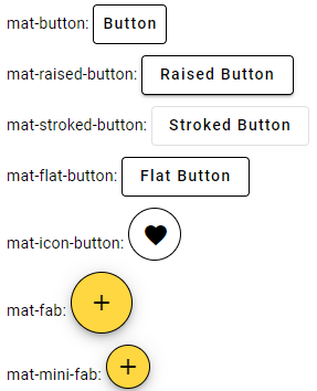
mat-button: This is the default type of button in Angular Material.mat-raised-button: This is a raised button with a shadow effect around it.mat-stroked-button: This is a button with a border and no background.mat-flat-button: This is a button with no background or border.mat-icon-button: This is a button that displays an icon instead of text.mat-fab: This is a floating action button with a circular shape.mat-mini-fab: This is a smaller version of themat-fabbutton.
Here are some examples of how to use these button variants:
<style>
  .button-row {
    margin-bottom: 10px;
  }

  div {
    margin-left: 10px;
    margin-top: 5px;
  }

  button {
    border: 1px solid black;
  }
</style>

<div class="button-row">
  <span>mat-button: </span>
  <button mat-button>Button</button>
</div>

<div class="button-row">
  <span>mat-raised-button: </span>
  <button mat-raised-button>Raised Button</button>
</div>

<div class="button-row">
  <span>mat-stroked-button: </span>
  <button mat-stroked-button>Stroked Button</button>
</div>

<div class="button-row">
  <span>mat-flat-button: </span>
  <button mat-flat-button>Flat Button</button>
</div>

<div class="button-row">
  <span>mat-icon-button: </span>
  <button mat-icon-button><mat-icon>favorite</mat-icon></button>
</div>

<div class="button-row">
  <span>mat-fab: </span>
  <button mat-fab><mat-icon>add</mat-icon></button>
</div>

<div class="button-row">
  <span>mat-mini-fab: </span>
  <button mat-mini-fab><mat-icon>add</mat-icon></button>
</div>
Here’s what the buttons look like:

All Angular Material buttons are fully customizable using CSS. This means you can easily modify their visuals to make them look like they’re built specifically for your website.
Button Colors
Angular Material Buttons can be customized with different colors without using any CSS.
You can use any of the predefined colors in your application or define custom colors using SCSS. If you’re interested in how to define custom colors and themes for Angular Material, check out this link.
Here are some examples of how to use predefined colors:
<button mat-raised-button color="primary">Primary</button>
<button mat-raised-button color="accent">Accent</button>
<button mat-raised-button color="warn">Warn</button>
Here’s how the buttons with the predefined colors look like:

Conclusion
You can use Angular Material Buttons in many ways to give your Angular app a professional look. By leveraging the different variants, styles, and colors available, you can create buttons that match your application’s design and color scheme.
To learn more about Angular Material Buttons, visit the official Angular Material documentation at https://material.angular.io/components/button/overview. Here you will find more detailed information on how to use Angular Material Buttons, including examples, API documentation, and best practices.
In addition to buttons, the Angular Material library provides many other UI components you can use in your application. These components include icons, cards, and forms, among others. By combining these components, you can create rich and interactive user interfaces that provide an enjoyable user experience.
Overall, styling buttons using Angular Material is an excellent way to create aesthetically pleasing and functional websites for any Angular developer. By leveraging Angular Material’s power and flexibility, you can create high-quality web applications that meet your business requirements and satisfy your website’s visitors.
You can browse through all our other Angular Material tutorials here or continue with the next tutorial, Angular Material Inputs.

