Here’s a short tutorial on how to display Material Icons using Angular Material. We will in this tutorial show you examples of how to utilize icons in your Angular application.
The icon module in Angular Material comes equipped with more than 2000 icons. The icons used in Angular Material are based on the Material Design icons, you can find a list of all icons on Google’s official documentation here.
Without further ado, let’s dive straight into the examples.
The Basics of Angular Material Icons
In order to start adding icons to your application you need to import the module MatIconModule to your Angular module:
import { NgModule } from "@angular/core";
import { BrowserModule } from "@angular/platform-browser";
import { AppRoutingModule } from "./app-routing.module";
import { AppComponent } from "./app.component";

import { BrowserAnimationsModule } from "@angular/platform-browser/animations";
import { MatIconModule } from "@angular/material/icon";

@NgModule({
  declarations: [ AppComponent ],
  imports: [
    BrowserModule,
    AppRoutingModule,
    BrowserAnimationsModule,
    MatIconModule,
  ],
  providers: [],
  bootstrap: [AppComponent],
})
export class AppModule {}
That’s it! You should now be able to add an icon to your application, let’s do that now:
<style>
  mat-icon {
    color: red;
  }
</style>

I <mat-icon>favorite</mat-icon> codingThis is the result of the code we just added:
See, that’s how easy it is to add an icon to your application using Angular Material.
Using Angular Material Icons with Other Elements
Instead of using icons as standalone elements in your application, did you know you can use them inside other elements?
In this section, we’ll walk you through the different ways you can combine icons with other elements to improve the aesthetics and user experience of your application.
Using Icons Inside Angular Material Buttons
If you wish to use icons inside a button, you can add the <mat-icon> element inside a button element. You also need to add matIconButton to your button element.
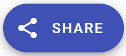
This is how you add a nice-looking button for sharing, which you can use in your application:
<button mat-fab extended color="primary">
  <mat-icon>share</mat-icon> SHARE
</button>This is how the button looks:
If you’re interested in learning how to use this Share-button in a real-world example, check out this example in our other article on Angular Material Cards.
How To Use Material Design Icons Font Library
If you want to use some specific icons which don’t exist in Angular Material Icons, you can import Material Design Icons Font Library to your application.
This extensive but lightweight font library features all Material Design icons (over 2,891 glyphs in a single font file with a wide range of design variants like fill, weight, grade, and optical size).
Start by installing the font library in your application, using npm:
npm install @material-design-icons/font@latestNext, you can import the icon font in your stylesheet (I added it to my styles.scss file):
@import "@material-design-icons/font";Now, you’re free to use any icon from the Material Design library, like this example:
<span class="material-icons">loyalty</span>
<span class="material-icons">person</span>
<span class="material-icons">download_done</span>Here’s the result:
Making Angular Material Icons Accessible
Icons do not provide any accessibility features out of the box when using Angular Material.
In order for your application to be compliant with screen-reader requirements and accessibility guidelines you need to add additional information and metadata to your icons.
When talking about accessibility, there are typically three types of icons:
Decorative Icons
Decorative icons provide no useful information. They are purely cosmetic and have no semantic meaning.
You should set the property aria-hidden="true" on all decorative icons in order to prevent screen readers from processing them.
Interactive Icons
This type of icon serves the purpose of handling interactions with the user. Interactive icons are commonly used on buttons where you feel it’s easier to explain the buttons purpose with an icon rather than a text.
It is important to add the property aria-label to the icons parent element, like in this example:
<button mat-fab extended color="primary" aria-label="Button for sharing the article on social media">
  <mat-icon>share</mat-icon>
</button>You can read more about the aria-label property here in the official W3 documentation.
Indicating Icons
Indicating icons are used to inform users, often as an alternative to long text messages.
Since it can be difficult for screen-readers to interpret what the icon is indicating, it is important that you make sure the icon has the aria-label property on it, explaining in text format what it’s indicating.
Conclusion
So, there you have it! It is so easy to improve your application’s user experience by using icons in Angular Material.
We have shown you how to add icons to your Angular application, how to use them together with other elements, and also mentioned how to use the extended Material Design Icons Font Library.
We hope you enjoyed following this tutorial… and remember to make your icons accessible, ensuring that everyone can enjoy your application or visit your website without running into issues.
Are you hungry for more tutorials? Then, check out our list of Angular Material tutorials here!
If you want to continue with the next Angular Material tutorial in our list, Angular Material Tooltips, you can read it here!