With Angular Material, you can easily create modern, responsive UIs for your Angular applications. Let’s learn how to use Angular Material to create professionally-looking websites, I’m gonna show you how to get started with Angular Material.
Learn Angular Material For Free
Did you know that we have other tutorials about Angular Material? You can start from scratch, follow our Angular Material tutorials, and have professional knowledge about Angular Material when you’re done.
Below is a list of all Angular Material tutorials we have published. Feel free to check them out if you want to learn even more about Angular Material.
- How To Import Angular Material To Your Angular Project
- Angular Material Buttons
- Angular Material Inputs
- Angular Material Cards
- Angular Material Checkboxes
- Angular Material Datepicker
- Angular Material Icons
- Angular Material Tooltips
- Angular Material Tables
- Angular Material Slider
- Angular Material Snackbar – Notifications
- Angular Material Toolbar
- Angular Material Progress Bars
If you’re just getting started I recommend you to continue reading this tutorial!
First Things First, Install Angular Material
Let’s start by installing Angular Material and its dependencies. You can install Angular Material to your Angular project by running the following command using npm:
npm install --save @angular/material @angular/cdk @angular/animationsNext, you’ll need to import the necessary modules in your Angular application. Open the app.module.ts file in your project and add the following lines:
import { NgModule } from "@angular/core";
import { BrowserModule } from "@angular/platform-browser";

import { BrowserAnimationsModule } from "@angular/platform-browser/animations";
import { MatToolbarModule } from "@angular/material/toolbar";
import { MatIconModule } from "@angular/material/icon";

import { AppComponent } from "./app.component";
import { AppRoutingModule } from "./app-routing.module";

@NgModule({
  declarations: [AppComponent],
  imports: [
    AppRoutingModule,
    BrowserModule,
    BrowserAnimationsModule,
    MatToolbarModule,
    MatIconModule,
  ],
  providers: [],
  bootstrap: [AppComponent],
})
export class AppModule {}
In the code above, we import the Angular Material modules MatToolbarModule and MatIconModule. These modules provide the necessary components and styles needed to create a good-looking toolbar with an icon.
Creating A Toolbar With Angular Material
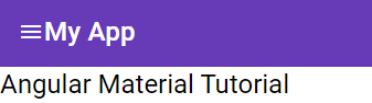
Once you have imported the necessary modules, you can start using the Angular Material components in your Angular templates. For example, to create a toolbar with an icon, add the following code to your app.component.html file:
<mat-toolbar color="primary">
  <mat-icon>menu</mat-icon>
  <span>My App</span>
</mat-toolbar>
<h1>Angular Material Tutorial</h1>
In the code above, we use the mat-toolbar component to create a toolbar with a primary color. We also use the mat-icon component to display the “menu” icon on the left side of the toolbar.
You can customize the look and feel of the Angular Material components by using CSS classes and styles. For example, you can change the font size and color of the toolbar text by adding the following styles to your app.component.css file:
mat-toolbar {
  font-size: 24px;
  color: white;
}
In the code above, we use the element mat-toolbar to style the font size and color of all text inside the toolbar.
If you run your application you should see this:
Conclusion
In conclusion, getting started with Angular Material is super easy. By following the steps outlined in this article, you can quickly add great-looking UI components to your Angular applications and create modern and responsive user interfaces.
Want to improve your web development skills with Angular? Browse our library of Angular articles for tutorials, tips, and best practices for building robust, responsive web applications. With everything from Angular basics to advanced techniques, we’ve got you covered.
Visit our other articles today to stay up to date on the latest trends and innovations! And don’t worry, if you don’t understand it, you can always just Angular it off!
